More grapes, since 1499. A story of people, wine, and land.
This phrase sums up our identity because it expresses what we are. Founded in 1499, Tenuta Villanova is today the longest-lived wine estate in Friuli Venezia Giulia.
The “ancient mansi”, which we have been cultivating for centuries, were acquired by the Chapter of Aquileia with a notarised deed renewing the lease to Pietro Strassoldo, a historical figure of these lands: in our archives, we still preserve the calligraphic parchments, first in Latin and then in Italian over the centuries. They are parts of a centuries-old history that speaks of this immense heritage made up of vines and human lives, the tradition and culture of the land, infinite passion, and hard sacrifices.
1932: the same family for 90 years
It is our untiring vocation to produce high-quality wines, which, even in the darkest years and during the most tormented historical events, has never been extinguished, interrupted, or dispersed.
Since 1499, Tenuta Villanova has been here.
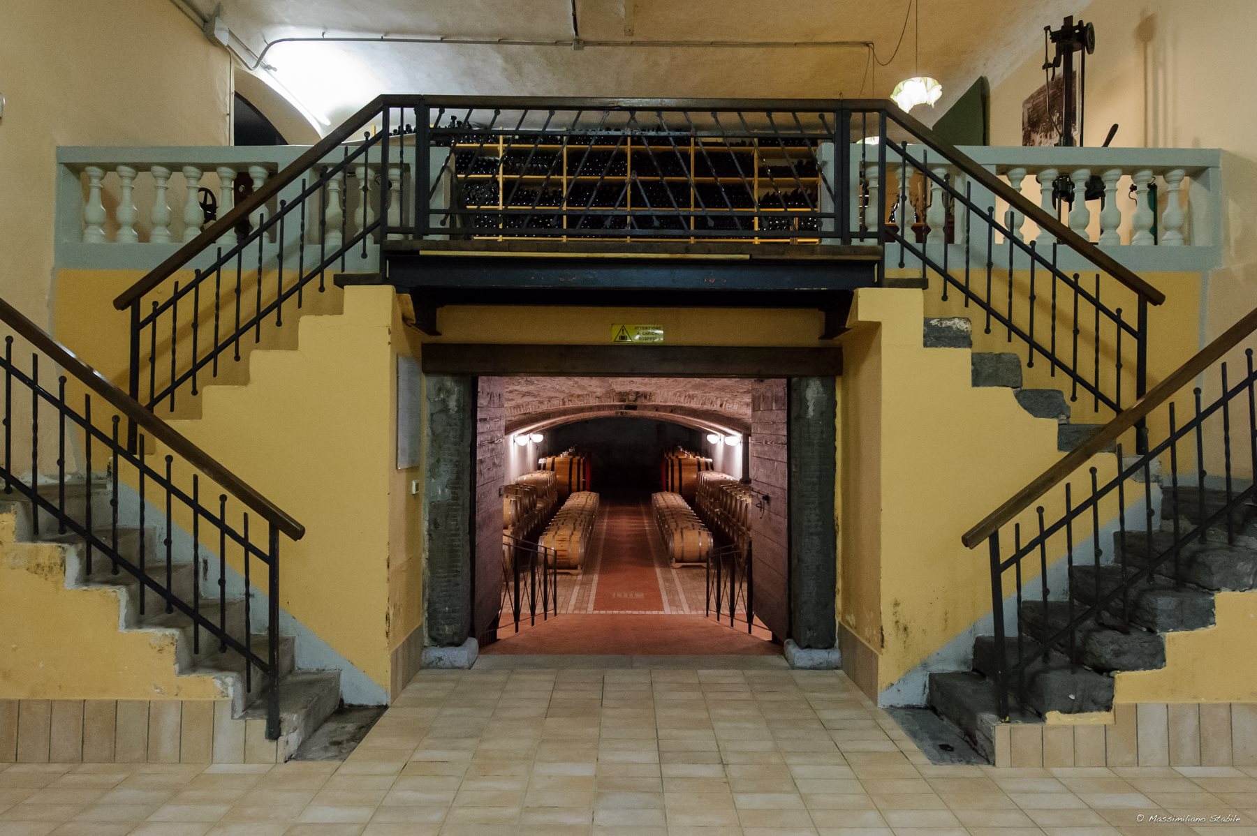
The architectural complex is an example of rural architecture of great historical value and comprises a multitude of spaces dedicated to housing people and things, all aimed at agricultural, wine and distillation production. The lodgings of the workers of yesteryear, who often lived on the farm with their families, are a unique testimony to this type of farming community deeply rooted in the land through its stable link with the estate: whole lives spent here, toiling hard but participating in a microcosm that provided stability.
A logo that is our world
The rebranding project that we recently initiated also involved a deep reflection on our identity. We needed to recognise ourselves in a contemporary but meaningful logo. The inspiration came from the map of the estate: an irregular but compact and composite shape, whose vineyards make up several pieces, all very important because they are the result of a careful zoning project. We reshaped it into a sort of graphic “morphing” that now contains, within a circle “cut” like a precious diamond, the totality of the crus. A unique and iconic logo that enshrines the love and respect for all our vineyards, which have always been our most precious jewels.
At the centre of it all, as in reality, is our beating heart: our farm.
Perhaps the most interesting and narrative aspect is what the brand has allowed us to do on the labels: each of our bottles highlights on the label the vineyard of origin, characterised by a precise identifying colour. And the correspondence between the graphic sign and the reality of the earth is exact.
Through the logo, our labels speak.